Sticky to Top Element
Adds a floating "Back to Top" button, fixed to the corner of the screen. It appears after visitors scroll down and smoothly scrolls back to the top when clicked. Fully styleable to match your site design.
In the YOOtheme Builder, open the element picker and look for the Joomill Extensions group of elements. Go to YOOtheme > Layout > Footer to add this element to every page.

Select the Sticky to Top element.
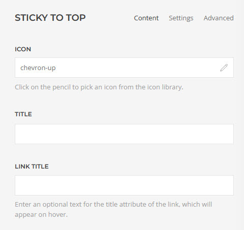
Content tab
| Icon | Click the pencil to pick an icon from the icon library. Defaults to a chevron-up arrow. |
| Title | Optional text next to the icon. |
| Link title | Optional text for the link's title attribute, shown on hover. |
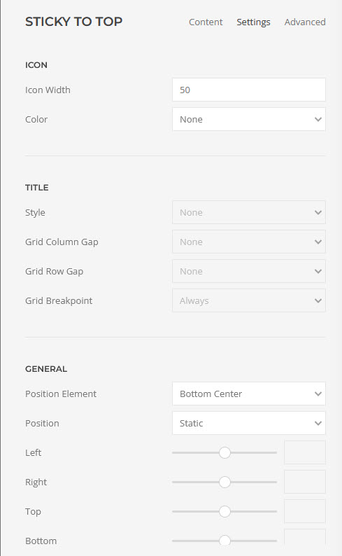
Settings tab
| Icon Width | The icon size in px. |
| Color | The icon color: None, Muted, Emphasis, Primary, Secondary, Success, Warning or Danger. |
| Hover Color | Optional icon color on hover or focus. Leave empty to keep the default. |
| Background | Optional background color for the button. |
| Border Radius | None, Rounded, Circle or Pill. |
| Padding | e.g. 8px or 8px 12px. Leave empty for none. |
| Box Shadow | None, Small, Medium, Large or X-Large. |
| Title Style | The style of the title text: None, Small or Meta. Only shown when a Title is set. |
| Grid Column Gap | Space between the icon and the title, when both are on the same line: None, Small, Medium, Default or Large. |
| Grid Row Gap | Space between the icon and the title, when they stack on top of each other. |
| Grid Breakpoint | The screen width below which the icon and title stack: Always, Small (phone landscape), Medium (tablet landscape), Large (desktop) or X-Large (large screens). |
| Tooltip | Optional text shown when hovering the button. |
| Accessibility Label | Screen-reader label for the button. Defaults to "Back to top". |
| Scroll Threshold | How many pixels a visitor needs to scroll before the button appears. |
| Position Element | Where the button sits on the screen: Top Left, Top Center, Top Right, Center Left, Center, Center Right, Bottom Left, Bottom Center or Bottom Right. |
| Position | Static by default. Change to Relative to fine-tune the position with the Left/Right/Top/Bottom offsets that appear. |
| Margin | The margin around the element: Keep Existing, None, Small, Medium, Default, Large or X-Large. |
| Visibility | Choose where to show the button: Show Always, Visible or Hidden on Small (phone landscape), Medium (tablet landscape), Large (desktop) or X-Large (large screens). |
Demo
See the bottom right of this page.