Branding tab
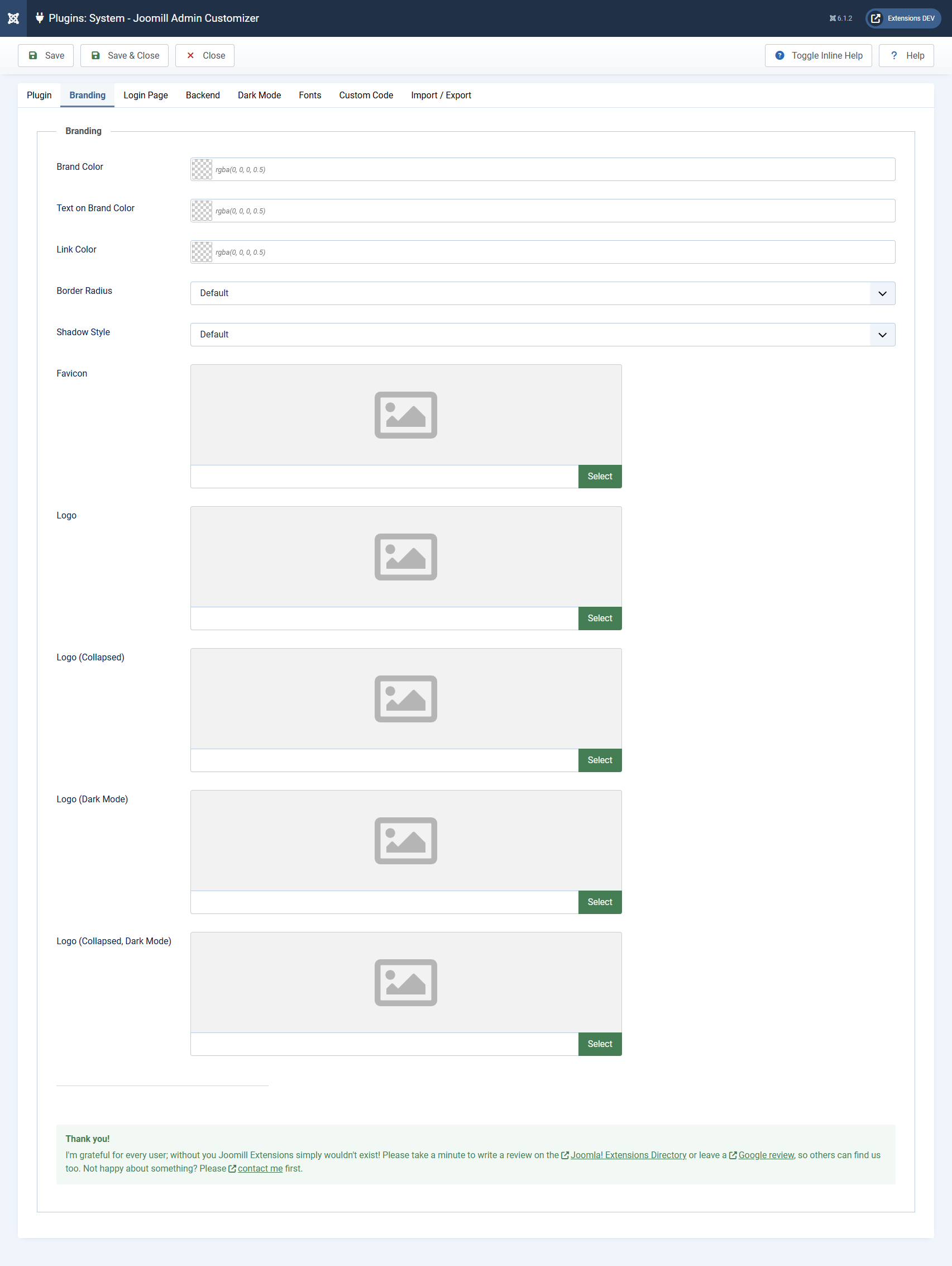
The Branding tab is the foundation of the plugin. The settings here are propagated across the whole administration area and are used as the default for the Login Page and Backend tabs. In most cases, setting a single brand color here is all you need.
Colors
- Brand Color: your primary brand color. It's used for the header and other accents throughout the administration area, and it drives Joomla's entire derived color palette. Individual sections can override it, and dark mode colors are derived from it automatically.
- Text on Brand Color: the text and icon color used on top of the brand color, for example the header title and header buttons. Leave it empty and Admin Customizer picks a readable light or dark value automatically based on your brand color.
- Link Color: the color for links throughout the administration area. Leave it empty to derive it from the brand color. If no brand color is set either, the original Joomla link color is used.
Border radius & shadow
These two settings control the overall "shape" of the interface and apply everywhere: buttons, form fields, dropdowns, alerts, the header, sidebar, cards and content panels.
- Border Radius: the rounding applied throughout the admin.
| Default | Keeps Joomla's own rounding |
| None | Perfectly square corners |
| Small / Medium / Round | Increasing amounts of rounding |
| Custom | Enter your own value in the Custom Border Radius field, e.g. 10px |
- Shadow Style: the depth applied to surfaces throughout the admin.
| Default | Keeps Joomla's own shadows |
| None | Flat, no shadows |
| Subtle / Medium / Strong | Increasing shadow depth |
| Custom | Enter your own value in the Custom Shadow field, e.g. 0 0 10px rgba(0,0,0,0.5) |
Favicon & logos
- Favicon: select an image from the Media Manager to use as the admin favicon (
.ico,.pngor.svg). - Logo: the main logo, shown in the header of the administration area on every page. It replaces the default Joomla logo.
- Logo (Collapsed): a compact logo variant, shown when the sidebar is collapsed. Use a small square mark or icon here.
- Logo (Dark Mode): an optional logo variant for dark mode. If left empty, the regular logo is used.
- Logo (Collapsed, Dark Mode): an optional compact logo variant for dark mode. If left empty, the regular collapsed logo is used.
Tip: Upload a light logo for light mode and a light-on-transparent version as the dark-mode logo, so it stays readable on the darker header.