Backend tab
The Backend tab fine-tunes the administration area itself: the main content area, the top header and the sidebar menu. Like the Login Page tab, everything here follows your Branding settings by default, so you only need to change what you want to differ.
The tab is split into three sections: Main Options, Header Options and Sidebar Options.
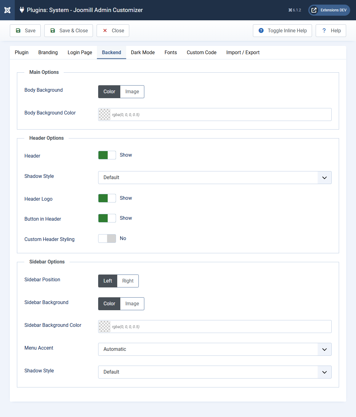
Main Options
Controls the background behind the backend content.
- Body Background: choose whether the backend background is a Color or an Image.
- Body Background Color: the background color, shown when Body Background is set to Color.
- Body Background Image: the background image, shown when Body Background is set to Image. When you choose an image, the Image Display options apply (Fill, Tile, Original, or Custom with position, repeat and size).
Header Options
The top bar of the backend.
- Header: show or hide the backend header. All other header options appear only when this is on.
- Shadow Style: the shadow under the header. Default follows the shadow style from the Branding tab; choose Custom to enter your own value.
- Header Logo: show or hide the logo in the header.
- Button in Header: show or hide the button area in the header.
- Custom Header Styling: by default the header follows your Branding settings. Enable this to set specific colors for the backend header. It reveals:
- Header Background Color: the color of the header bar.
- Header Title Font Color: the color of the title text in the header.
- Header Logo Background Color: the background behind the logo (when the header logo is shown).
- Button Background Color: the background of the header buttons (when the header button is shown).
- Button Font Color: the text/icon color on the header buttons.
- Button Icon Background Color: the background color of the button icon.
Sidebar Options
The main navigation menu on the side of the backend.
- Sidebar Position: place the menu on the Left or the Right.
- Sidebar Background: choose whether the sidebar background is a Color or an Image. When you pick Image, the Image Display options apply (Fill, Tile, Original, or Custom with position, repeat and size).
- Sidebar Background Color: the background color of the sidebar menu.
- Menu Accent: the color used for menu hover and active states:
| Automatic | Derives neutral shades from the sidebar color |
| Brand Color | Tints hover and active states with your brand color |
- Shadow Style: the shadow on the sidebar. Default follows the shadow style from the Branding tab; choose Custom to enter your own value.
Note: Whatever sidebar color you choose, Admin Customizer automatically sets a readable text color for the menu items and calculates matching hover and active shades, so the menu stays legible without any extra settings.